
Related Images


This image was acquired from
flickr. It was marked as Public Domain or CC0 and is free to use. To verify, go to the source and check the information there.
Looking for more info about this image?
Try a Google Reverse Image Search for it.
Try a Google Reverse Image Search for it.
Keywords from Image Description:
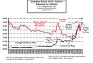
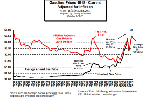
text American graph demonstrating the relative affordability of gasoline from the infancy of the petroleum industry to today. The black line represents the national average price of gasoline at each year. The red line represents the national average price of gasoline adjusted for inflation so as to express the historical price in