
Related Images

Download:
| Tiny | 280x128 | View | Download |
| Small | 560x256 | View | Download |
| Original svg | 703x321 | View | Download |
| Original as jpg | 703x321 | View | Download |
This image was acquired from
wikimedia. It was marked as Public Domain or CC0 and is free to use. To verify, go to the source and check the information there.
Looking for more info about this image?
Try a Google Reverse Image Search for it.
Try a Google Reverse Image Search for it.
Keywords from Image Description:
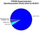
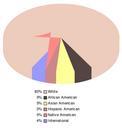
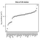
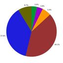
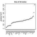
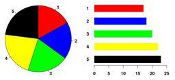
Piechart.svg Example of pie chart along with bar plot showing the same data and indicating that the pie chart is not the best possible chart for this particular dataset The graphic was created by User Schutz for on December using the rproject org statistical project The program that generated the graphic is given below the data