Download:
| Tiny | 141x128 | View | Download |
| Small | 283x256 | View | Download |
| Medium | 566x512 | View | Download |
| Original svg | 676x611 | View | Download |
| Original as jpg | 676x611 | View | Download |
This image was acquired from
wikimedia. It was marked as Public Domain or CC0 and is free to use. To verify, go to the source and check the information there.
Looking for more info about this image?
Try a Google Reverse Image Search for it.
Try a Google Reverse Image Search for it.
Keywords from Image Description:
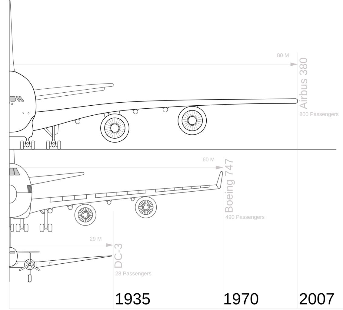
Wignspan Diagram.svg en This is comparison diagram showing major airliners and their increased size over time The passenger capacity numbers are maximum number The airlines often carry far fewer passengers due to allowing more space for business and first class customers The Data for wingspan and year for the and Airbus are taken
